Find a running list of tips and tricks for styling templates in Designer below!
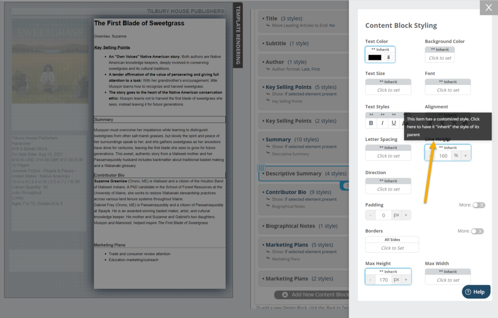
- Inherited Styles: In Designer, you can set individual styles for each design or content block used in your template, But you can also set blocks to “Inherit” their style, which means that the block will use the styles set at the template (“Parent”) level. For this reason, if you have added custom styles a particular content block but wish to return it to your Template’s default styles, you should use the Inherit option to return it to the parent style. Hover over the ** Inherit banner on a particular style element to see if it is inheriting the parent style and, if not, click to return it to that setting.

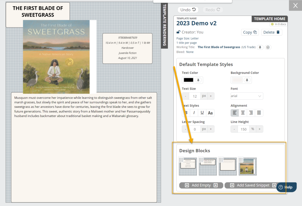
- Design Layers: It is possible to overlap and layer design blocks when creating/editing a template to achieve certain effects (see Adding Callouts). The order of the layers is determined by the order of the design blocks on your Template Home. The order goes from bottom to top (the rightmost design block will be on top).
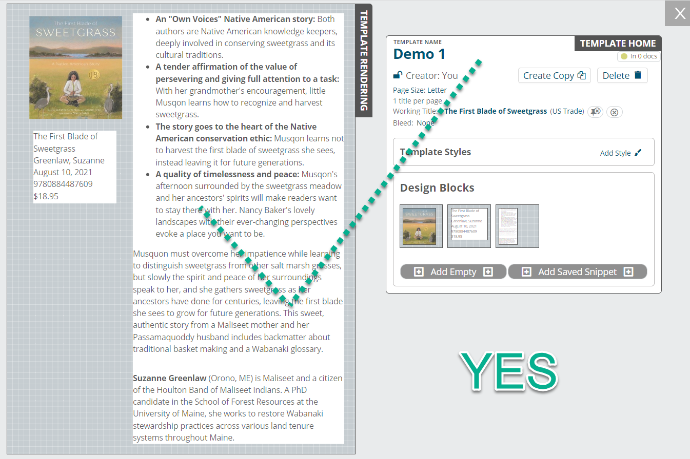
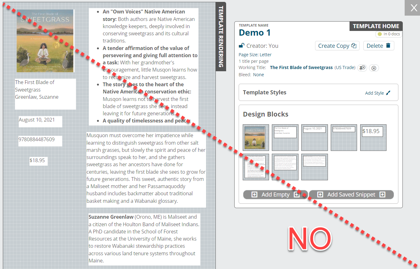
- Less is more: The fewer design blocks, the better. Rather than creating many design blocks going down the page in your templates, remember that it’s best to have just a few design blocks that act as containers for your content blocks. It isn’t necessary to create numerous design blocks to space out elements. Instead, make use of inner padding or margins to help situate your content.


- Creating multiple title per page templates: A common mistake we see is when users attempt to create, for example, a two-title-per-page template. Rather than adding two sets of data elements for each of the two titles, be sure to select the desired number of titles across and down when creating your template.

This will allow you to design one section of content. This can be confusing, but note that the blank space to the right of the title shown below will be automatically populated with a second title once you select this template in the document creation process.


